Common Data Viz Mistakes to Avoid
Introduction
Creating intuitive, effective data visualizations takes skill. Even simple seeming charts and graphs harbor potential pitfalls that distort information and confuse audiences.
This comprehensive guide explores common data visualization mistakes to be mindful of avoiding. We will cover:
- Most frequent data visualization mistakes and missteps
- How to avoid cluttered, chaotic and overwhelming data viz
- Tips for preventing misleading distortions or ambiguity
- Strategies to steer clear of non-insightful visuals that lack focus
- Approaches for more thoughtful formatting and visual encoding
- Practices to avoid lack of context or reference points
- Methods for preventing inaccessible and confusing color choices
- Real examples of data viz mistakes and improved alternatives
By the end, you will have greater awareness of potential data visualization traps along with tactics to avoid them. Let’s explore how to refine your data viz approach!
Why Data Visualization Mistakes Matter
Avoiding common data visualization mistakes is crucial because they:
- Distort facts and findings leading to incorrect takeaways
- Obscure real insights and patterns within data
- Create ambiguity leaving interpretation unclear
- Overwhelm audiences with unnecessary complexity
- Mislead audiences unintentionally
- Cause accessibility issues excluding portions of audiences
- Undermine audience trust in and comprehension of data
- Ultimately result in data visualizations that fail to inform or activate audiences
Dodging these pitfalls through mindful design results in more truthful, understandable data stories.
Most Common Data Visualization Mistakes to Avoid
Here are most frequent data visualization missteps to be aware of:
Cluttered Overly Complex Visuals
Avoid squeezing too much data onto one chart or cramming multiple chart types together.
Misleading Scaling and Axes
Be careful axes start at zero and aspect ratios match data appropriately.
Generic Boring Design and Formatting
Don’t just default to native visualizations in Excel. Customize thoughtfully with intentional design.
Visual Embellishments That Don’t Add Insight
Skip excessive ornamentation like unnecessary 3D effects or clipart.
Lack of Focus and Clear Message
Ensure every visualization aligns to a specific insight vs showing general data.
Ambiguous Relationships Between Elements
Make sure elements are formatted to clarify connections and significance.
Confusing Unexplained Color Coding
Label legends clearly and limit colors. Don’t assume meaning is obvious.
Lack of Context and Reference Points
Add explanatory annotations so data linkage and importance is clear.
Let’s explore some of the most common specific pitfalls in more detail…
Avoid Cluttered, Overwhelming Data Visualizations
Some key ways clutter undermines data viz effectiveness:
- Too much data crammed onto one chart overwhelms cognition
- Unnecessary chart adornments like grids compete for attention
- Trying to show multiple data dimensions muddles main point
- Excessive detail obscures high level trends and patterns
- Weak visual hierarchy makes key focal points unclear
- Chaotic scattered layouts with no alignment diffuse focus
Keep data viz uncluttered by:
- Simplifying charts to just key variables needed for main insight
- Removing unnecessary visual elements like grids, borders and boxes
- Using minimalism and whitespace to direct attention
- Planning layouts with intentional visual hierarchy and flow
- Grouping related elements through alignment, proximity and containment
Decluttering eliminates distraction to amplify comprehension and recall of key data insights.
Prevent Distorted or Misleading Data Representations
Some ways data viz design can inadvertently mislead include:
- Axes not starting at zero exaggerating small changes
- Inconsistent axes scales across charts hiding true relationships
- Aspect ratios not matching real data proportions
- Choices of 2D versus 3D charts conveying false volume
- Gaps between time periods on line charts hiding missing data
- Non-uniform binning on histograms showing false patterns
You can prevent misleading data visualization design by:
- Setting consistent axes scales across multiple charts
- Ensuring axes start at zero unless intentionally cropping a small range
- Choosing appropriate 2D versus 3D charts that don’t distort data
- Setting aspect ratios directly proportional to real data range
- Avoiding gaps in timelines unless explicitly called out
- Using clear, uniform binning and ranges on histograms
With mindful design choices, you can build viewer trust by representing data accurately.
Create More Intentionally Designed Data Visualizations
Some issues that arise from quick default design:
- Clashing unrelated color palettes straining readability
- Weak color contrast obscuring key patterns and points
- Unnecessary generic visual embellishments that contribute no insight
- Labels and keys with overly technical jargon versus plain language
- Lack of visual grouping, alignment and boundaries to interconnect related elements
- Unsorted scatter plots and timelines hiding relevant sorting insights
You can level up thoughtfulness in data visualization design by:
- Curating accessible color palettes intentionally suited for key insights
- Establishing clear visual hierarchy through strategic color contrast, size and layout
- Removing all non-essential decorative elements to increase signal vs noise
- Composing clear, conversational annotations using plain language
- Using alignment, proximity, containment, connection and boundaries to give structure
- Sorting plot order deliberately when relevant to highlight patterns
Thoughtful design choices tailored to focus your specific data story results in more polished, purposeful data viz.
Ensure Data Visualizations Have a Clear Focal Point
Data viz without a specific story often:
- Displays data without a specific insight, relationship or conclusion
- Contains interesting charts but with no unified message
- Visually represents data variables without revealing discoveries, meanings or implications
To give data visualizations clarity of purpose:
- Identify one primary insight or finding to communicate before creating charts
- Design visual flow and formatting to focus on that sole concluding insight
- Omit interesting data points if they distract from the core relationship or pattern identified
- Use minimalism to direct attention only to elements supporting the main takeaway
- Add concise annotations directly reinforcing and explaining the focal insight
Maintaining a clear purpose and message helps avoid meandering data viz that tries to show all the facts without revealing the most meaningful insights.
Clarify Relationships Between Data Visualization Elements
Formatting choices should explain connections between data viz components. Watch for:
- Colors applied without explaining categorical meaning
- Key patterns like ups and downs buried visually
- Connection lines between correlated elements missing
- Clustering or containment absent to link associated elements
You can clarify relationships within data visualizations through:
- Color coding consistently to illuminate grouping
- Ordering, sizing and positioning elements by importance to show hierarchy
- Using alignment, proximity and visual boundaries to tie related components together
- Including connection lines and flows to explicitly link relevant elements
- Annotating explanations of key patterns and associations directly on visuals
Intentionally formatting data viz elements makes relationships, meanings and conclusions clear at a glance.
Avoid Confusing Color Choices in Data Visualization
Some key color pitfalls to avoid:
- Color without consistent meaning attached
- Colorbrewer palettes with high color blindness strain
- Too many colors competing for attention
- Weak color contrast obscuring key patterns
- Light colors lacking enough contrast with white background
- Critical information conveyed through color alone
You can improve data viz color choices by:
- Limiting to 2-4 complementary colors with deliberate meanings
- Testing palettes for accessibility before incorporating
- Establishing distinct value contrast between colors
- Adding dark outlines and gridlines to light colors
- Also encoding importance through size, text weight, positioning
- Explaining color meanings clearly in a legend
Strategic, accessible color design keeps focus on illuminating meaningful data insights.
Add Adequate Context and Reference Points
Without explanatory context, data visualizations risk leaving audiences guessing. Avoid:
- Lack of titles explaining visualization purpose
- No labels clarifying what data variables and values represent
- Absence of summary statistics detailing trends
- Values on axes lacking units and contextual meaning
- Assumed familiarity with obscure data being visualized
You can boost understanding by incorporating:
- Descriptive titles explaining visualization focus
- Axis, tick and legend labels clarifying data variables
- Annotations calling out key statistics and summaries
- Scales, units and baselines providing important frame of reference
- Straightforward annotations using plain language to maximize comprehension
Adding reference points through thorough labeling and concise captioning ensures audiences can interpret data accurately.
Real World Data Visualization Mistakes and Improvements
Let’s examine some real examples and how mindful design principles can remedy common data viz pitfalls:
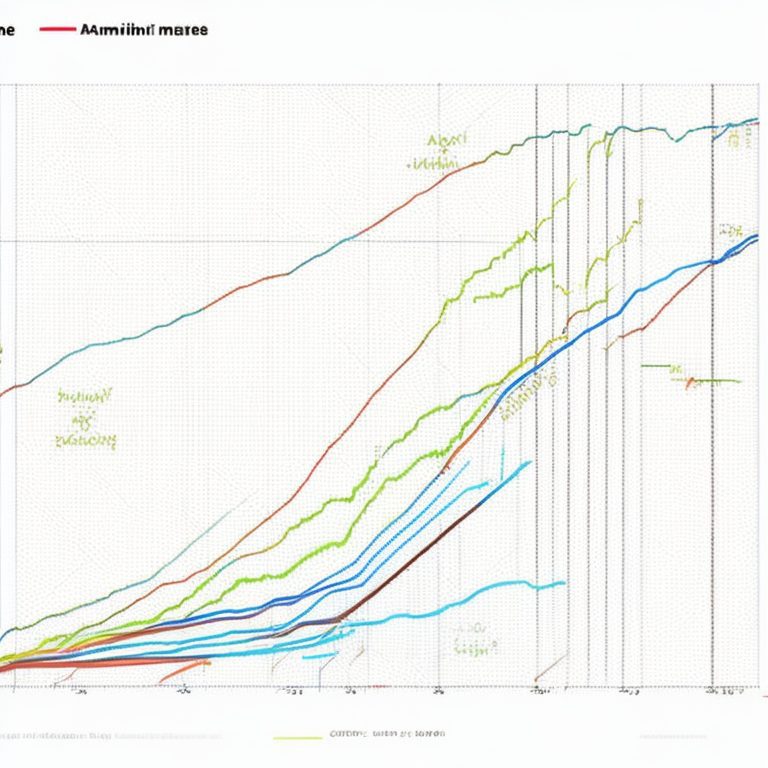
Overly Dense Line Chart

This ambition line chart attempts to show 6 variables across 20 years. The spaghetti maze of crossing lines obscures the main trend.
Simplified for Clarity

Pruning down to just the 2 most relevant variables across a narrowed meaningful date range clarifies the main relationship.
Misleading Axis Scale

Not starting the y-axis at zero exaggerates a minor change as a huge gain.
Axis Zoomed for Honesty
Setting axis to start at zero displays the change in proper context.
Unclear Outlier Labeling
It’s unclear what the dot outliers represent without more descriptive labeling.
Clearer Context Added
Adding annotation clarifies the outlier data points as significant earthquakes.
With more thoughtful design, we can remedy common data visualization pitfalls that impede understanding and integrity.
Key Takeaways
Some best practices that help avoid frequent data viz mistakes:
- Simplify complex charts down to the key variables and insights
- Represent data accurately through thoughtful formatting choices
- Guide focus intentionally through visual hierarchy and flow
- Limit color variety and define meanings clearly
- Add ample labeling, context and reference points
- Remove non-essential visual elements that don’t add information
- Make strategic design choices, avoiding defaults without purpose
Dodging common pitfalls results in reliable, intuitive data stories audiences can trust and engage with.
Conclusion
In summary, even common data visualization mistakes can profoundly undermine audience comprehension and trust. But keeping established data viz design best practices in mind helps avoid accidental misrepresentation and confusion. Spend time reflecting on the core meaning and story you want to convey before construction visuals. Then leverage strategic design principles to guide viewer attention and illuminate that meaningful narrative clearly and completely. With care and practice, you can become an expert at translating complex data insights into accurate, engaging data visualizations that reliably inform audiences.